SIBOS.COMEvent platform
A design fit for the world’s premier financial event
Ever since its creation in 1978, Sibos has become “the place to be” for over 8000 executives, influential decision-makers and thought leaders in the financial industry. Up until recently, however, the website hadn’t quite been up to Sibos’ standards. That’s where we stepped in: to revamp the platform and take their brand together. For such an ambitious, all-out redesign, trust is key.
Fortunately, we knew the Sibos team well. Thanks to the great relationship we had developed with SWIFT over a wide range of projects - websites, mobile apps, extranets, applicative interfaces and overall digital strategy - they trusted us to take the risks we needed to explore just how far we could take their brand.
01 The story
Should the new Sibos.com be an evolution or a revolution? For such an iconic event with tremendous brand equity, we wanted to engage users and encourage the creation of bridges between the Sibos brand and theirs.
Just how do you go about creating a website that lives up to the prestige of the world’s premier financial event? By modeling Sibos.com after the event itself: setting up an online meeting place for all the different touch points to come together.
02 Immersive and highly visual design
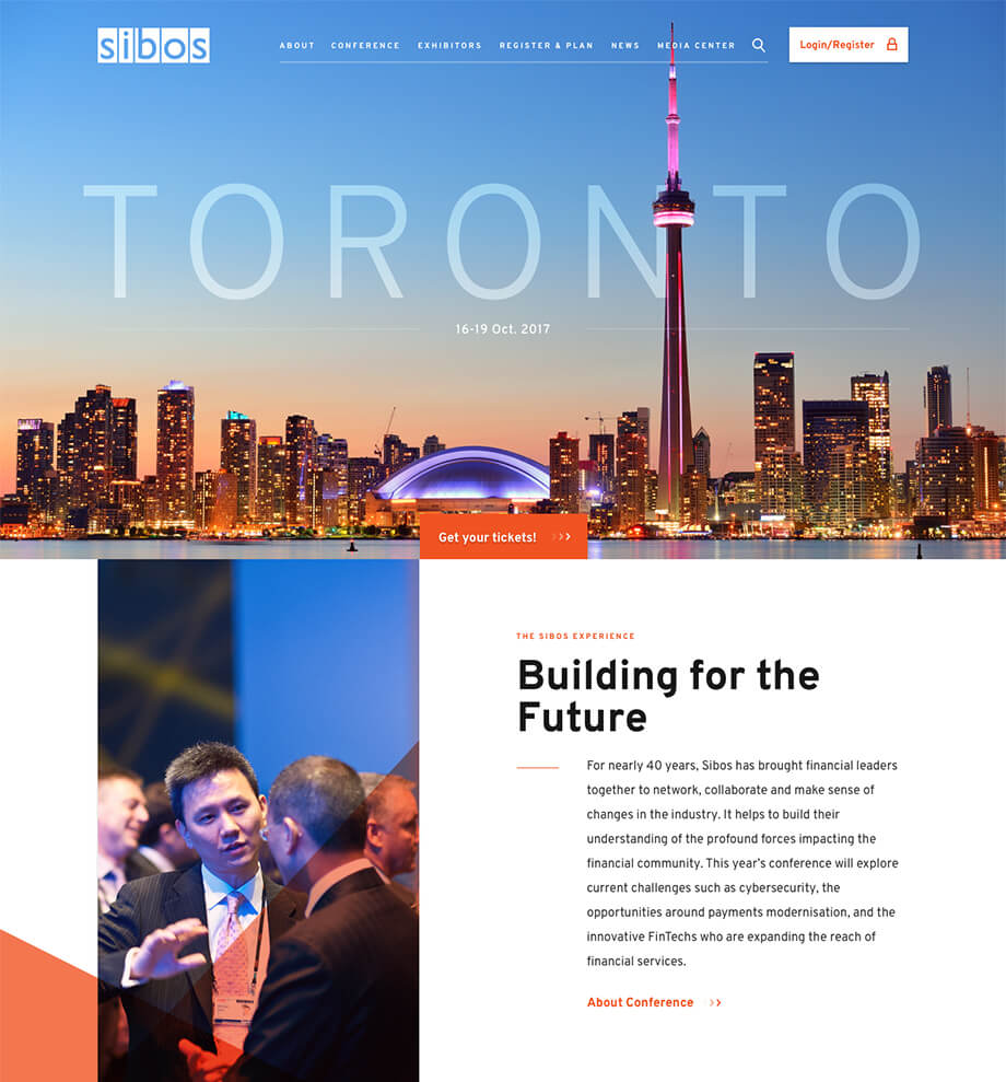
We went for a strong storytelling approach, allowing participants to discover the city and venue with the conference’s theme as inspiration.
03 Sibos: The Brand
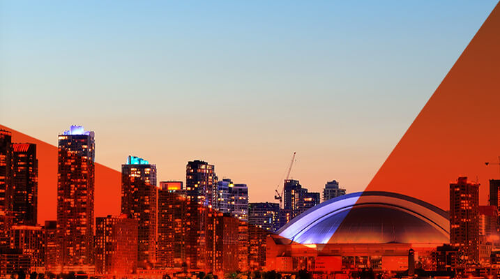
In designing the new website, we dove deep into the Sibos’ brand. Ultimately, we knew we needed a design as colorful as the brand itself and set off to create a platform that incorporates all of the colors of the brand’s unique spectrum.
Shapes & Colors
In creating the visuals for the website, we went back to basics with colors, shapes and patterns. Combined, they create an energetic and visually engaging ensemble that embodies the Sibos experience.
Homepage
News
Plan & register
Exhibitors
Media center
Adieu to Arial
All of Sibos’ digital channels used the same tired typeface : Arial. Thankfully, we convinced our client to switch things up. While it wasn’t easy to find her, after extensive research, collaboration and communication with the Art Director of Sibos, we made the move to our new fabulous friend: Overpass.
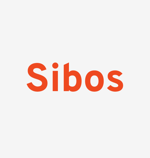 Overpass
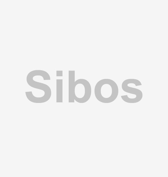 Arial Bold


04 An all-year-round experience
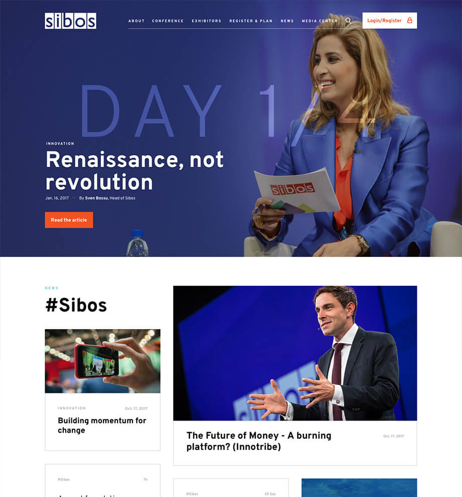
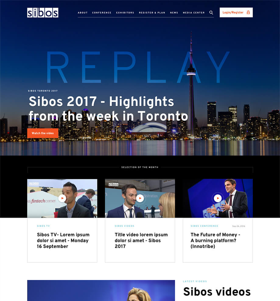
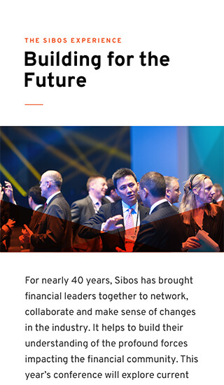
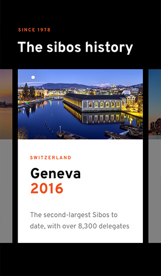
How do you make a 4-day-long event last 365? We opted to incorporate content all year round to keep up a steady rhythm of activity. Depending on key events, we programmed the website’s design to convey a different feel.
Making it all work
Along with putting together a robust infrastructure to support the heavy traffic on the website during the event, we created a set of protected tools (messaging service, event planner, contact sharing between delegates, etc) to make the website an attractive platform both before and after the event. An extensive system of web services keep everything in sync from our public website, the Sibos mobile applications, the Exhibitor portal, and to many other platforms managed by the Sibos task force.
- The
Homepage - 1 month
before - First
day - After
the event
