EUROPEAN PAYMENTS COUNCILCorporate website
Giving the European Payments Council control over its digital presence: a Drupal website for SEPA payment schemes
The European Payments Council (EPC) is a voice for payment service providers in European payment affairs. While the EPC might be invisible to users on the tail end of transactions, it is essential in carrying out euro transfers and debit transactions.
Their payment schemes are adopted by over 4,000 payment service providers, facilitating some 37 billions worth of transactions every year!
01 The Story
We have walked with the EPC for over a decade, encouraging the evolution of its website through the creation of new versions whenever necessary. The new EPC website proved especially challenging from a technological standpoint. It required that we organize massive amounts of files in a way that was both easily manageable for the EPC and visually clear and accessible for its visitors. What’s more: we had to strike a balance between meeting industry standards - the use of Drupal - and implementing a platform tailored to the EPC’s identity and needs - incorporating intranet and extranet tools, for instance!
02 Placing power in the hands of our clients and their users
The EPC aims to provide consumers with clear and accessible information on payment schemes. For us, this meant providing our client with the right tools to be in control of their website. As such, we created a content management platform, which when combined with our custom flexible page builder, would allow the content publishing team to reuse rich templates packed full of features.
We chose Drupal
We chose Drupal as it was important that our clients take part in an innovative, collaborative and secure online community. We made sure to integrate a proactive, round the clock monitoring system to accompany the EPC team throughout the development process.
Tracking the evolution: the brand, the role and the mission
This is not our first or second but third all-out website recast with the EPC, our client of over ten years and counting. Working with a client over such a long period of time pushes us to put our work into perspective and to adjust to our clients’ needs as they evolve with the internet. For a good while, the EPC was considered a politically-involved SEPA ambassador ; today, however, it serves as an agent for implementing and providing information on the system that has been built over the years. The website needed to reflect that transformation.
03 Clearing the way for our client to focus on the end goal
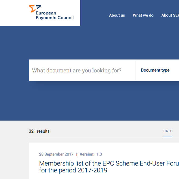
Organizing the thousands of documents in the EPC’s possession to create an easy-to-use document library was quite the task! We matched quantity with quality to deliver an accessible content library with a legacy.
04 It’s the little, big things
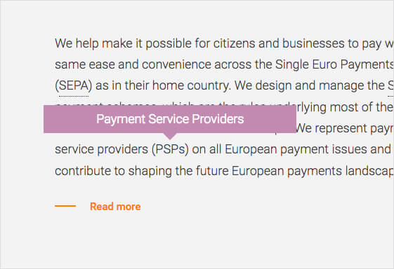
Automatic glossary
Such an intricate and extensive project brought us to brainstorm ways of making the user experience as smooth as possible. Just some of the ways we went about doing so include an automatic glossary allowing customers to easily navigate through the acronym-laden world of B2B finance.
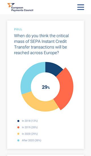
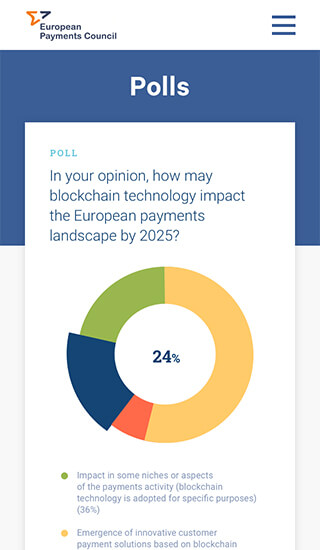
Easy polls
We also dedicated an entire section to polls led by the EPC, making sure to convey the results in a clear and instructional way.
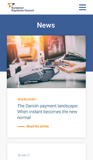


Fulfilling user needs through flawless design: always at the heart of our process
For this project, the main UX challenge was to find a research tool that allowed visitors to both find and understand the information they were after as quickly, easily and pleasantly as possible. To create the ideal conditions, we integrated the space users needed directly into the website’s design with an light and airy feel.
Michele Cinquino UX/UI designer