How merging creativity and technology helps us brand better
Capturing Xelsia’s energetic spirit and translating it into a dynamic, moving brand


When we had our first meeting with Isabel and Sven to discuss the website for their new company, we were greatly impressed by their enthusiasm. And although they had already decided upon a name and an identity for their business, we knew they deserved even better!
Inspired by the dynamic spirit of the two owners of the company, we suggested they align their brand with their strong entrepreneurial personalities. Our goal was to deliver a bold and consistent brand that would mark their unique style and stand out from the competition in their market: the (very corporate) consultancy industry. We wanted their brand to inspire trust and to be associated with high quality. But most of all, we should feel their energy, their capability for change, movement and flexibility.
The first step was to change the company name from Excelsia to xelsia — bolder, more fun, and yes, more dynamic.
 Less letters
 More movement ❤
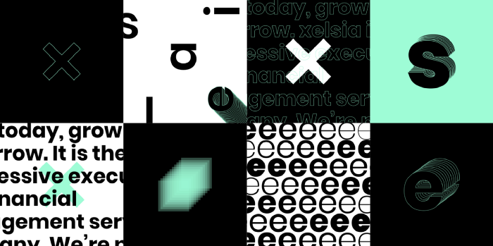
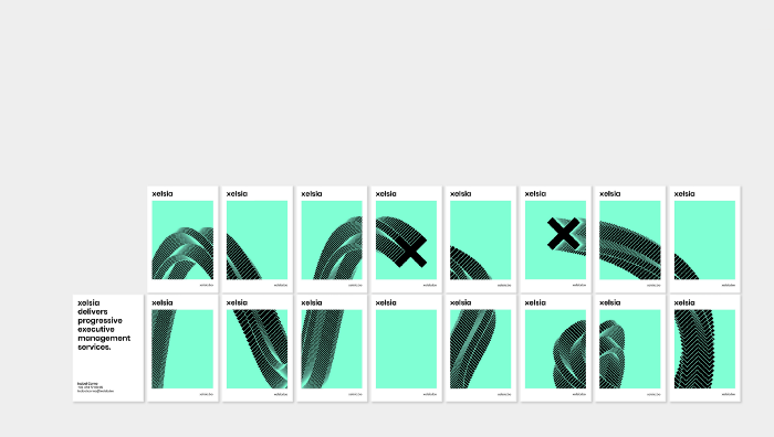
The name xelsia allowed for a very pure logo, simplified to its essence. The choice of a bold font type allowed the letter “x” to become a catchy element. This simplicity allowed us to then stretch the logo to its limits as we applied it to different media. Business cards became a set of playing cards, and the xelsia website sticks to you thanks to its liquid brand animation.

 Lovely business cards —It’s not just for the web
At Walking Men we are fans of dynamic branding, as it has the ability to be more emotional and connect better to the daily changing world. And for us, as a digital agency, it gives us a real playground for merging creativity and technology.
The result is a very distinct style for this new brand identity, moving in a corporate world where you need to be brave to be fun!
👀 Check the full result on their website