A New Logo for DoubleDouble
StoryStory of a rebranding

DoubleDouble is a film and animation production company located in Brussels. A double competency, sometimes little known, which was the starting point of our thought process for the creation of their new visual identity.
The Three-Hour Brand Sprint
We relied on the method described by Jake Knapp to lead a workshop to better get to know DoubleDouble, their team, and their values.
The most interesting exercise for me remains the one defining the agency’s personality in the present, and the one it would like to have in the future.
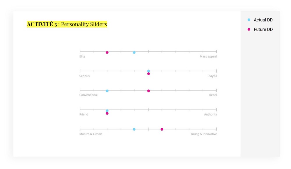 A nice change to come, according to this screenshot
...
Wait, what if it was just a brand refresh?
The initial research was directly based on the existing monogram, shown below.
If for the new identity of Walking Men, starting with the monogram (WM) had seemed the easiest approach, with DoubleDouble, it was quite the opposite…
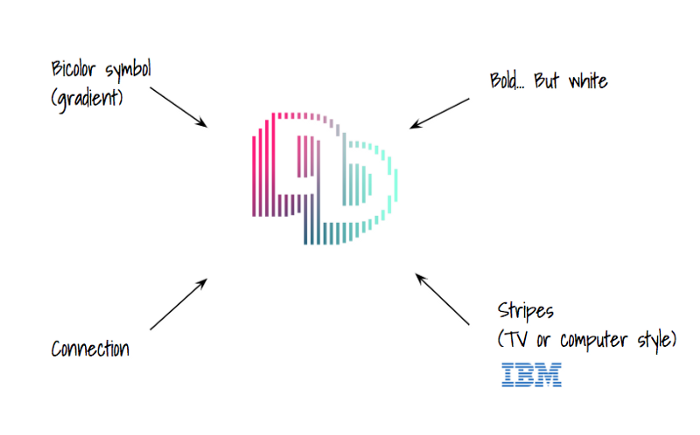 A quick analysis can’t hurt
Three logotypes base on the monogram were presented:
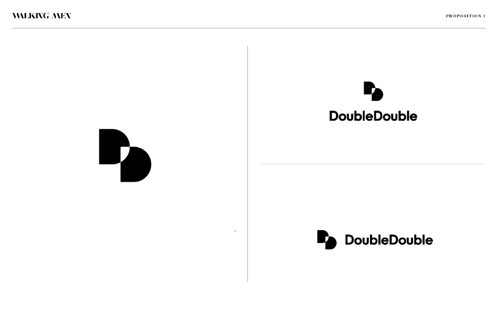 Simplicity & Impact
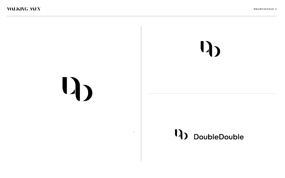 Elegance & Singularity
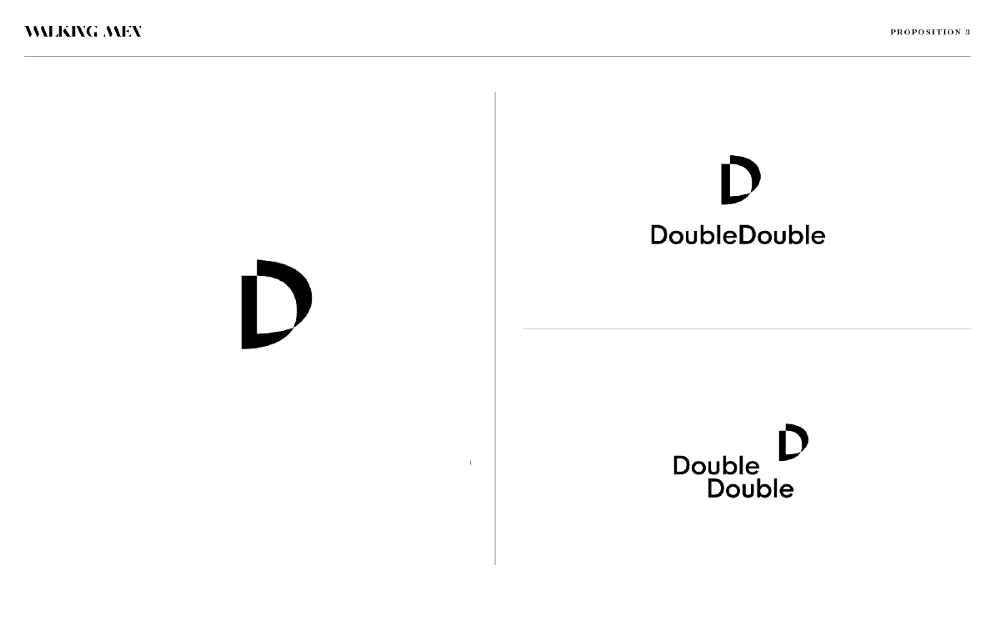 Sophisticated & Modernity
These initial ideas each expressed in their own way the values chosen by DoubleDouble, though without totally convincing our client.
...
And if, actually, it was not just a refresh in the end?
After a few weeks, I was not very sure either of the relevance of this sign. One “D” higher than the other, a “forced” overlap of the two letters… Hmm. Nothing seemed natural in this design. What was more, the potential misreading as a capital “B” was confusing.
I doubled down on my research.
...
Thank you, moodboards
In this type of situation, I often go back to basics: creating moodboards (for all aspects of the creation; font type, colors, pictures, etc):
So what about the site?
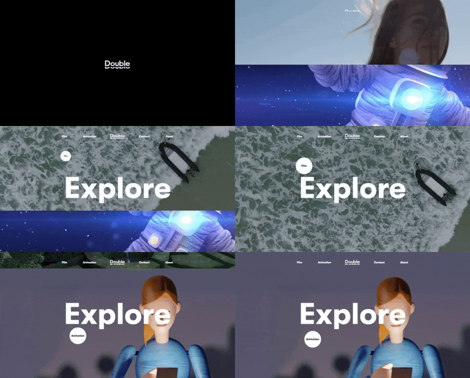
In parallel, the redesign of the website was underway, making the exercise difficult. However, there was one point we were certain of: we needed to distinguish very clearly the skills “Film” and “Animation”. Which meant, for example: two showreels, and therefore, two possible entry points into the site.
Falling by chance on a collage particularly echoing the UX’s thought process, the DoubleDouble universe began (finally) to take a much more relevant shape.
And what about the logo?
The repetition of the word “Double” already evokes the idea of a “duo”. We had to make the logotype more easily understood by taking advantage of the redundancy of the word.
The challenge seemed immediately more exciting: read “DoubleDouble” without having to repeat the word in the sign. At the same time, I also began to try to imagine this logotype in motion.
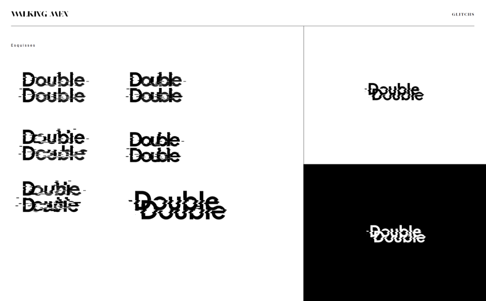 “Glitches”, the easy route
Finally, on February 22, 2018, a proposal caught our attention:
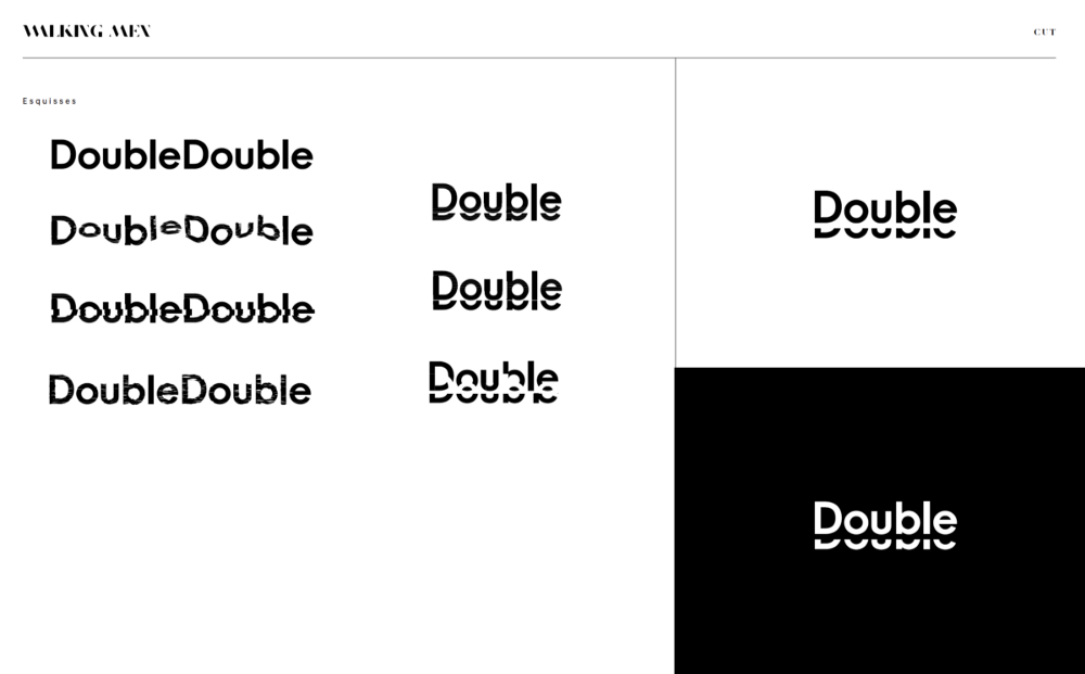 CrazyCrazy cool. Isn’t it?
Even if you’re not re-inventing the wheel, at least stay the course
Synchronicity, great minds, and all that. On October 18, 2018, Octave Octave (venerable Parisian communication agency) presented their new visual identity, cold sweats guaranteed:
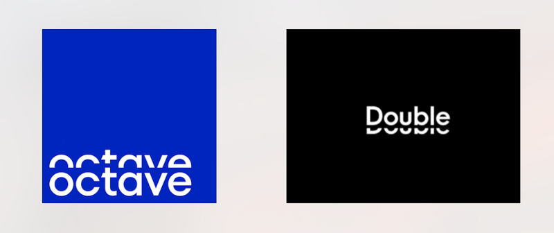
Fortunately, we had in mind a whole new universe to develop around the brand. Michele Cinquino ( UX/UI Designer @walkingmen, illustrator, passionate about lettering and typography) lent me a hand to balance the sign as a whole.
Laurent Stine, the founder of DD being a big fan of the CinemaScope screen ratio, a severely widescreen format, we went all in: the silhouette of the logotype is slightly crushed, the sign is more anchored in the ground, bolder.
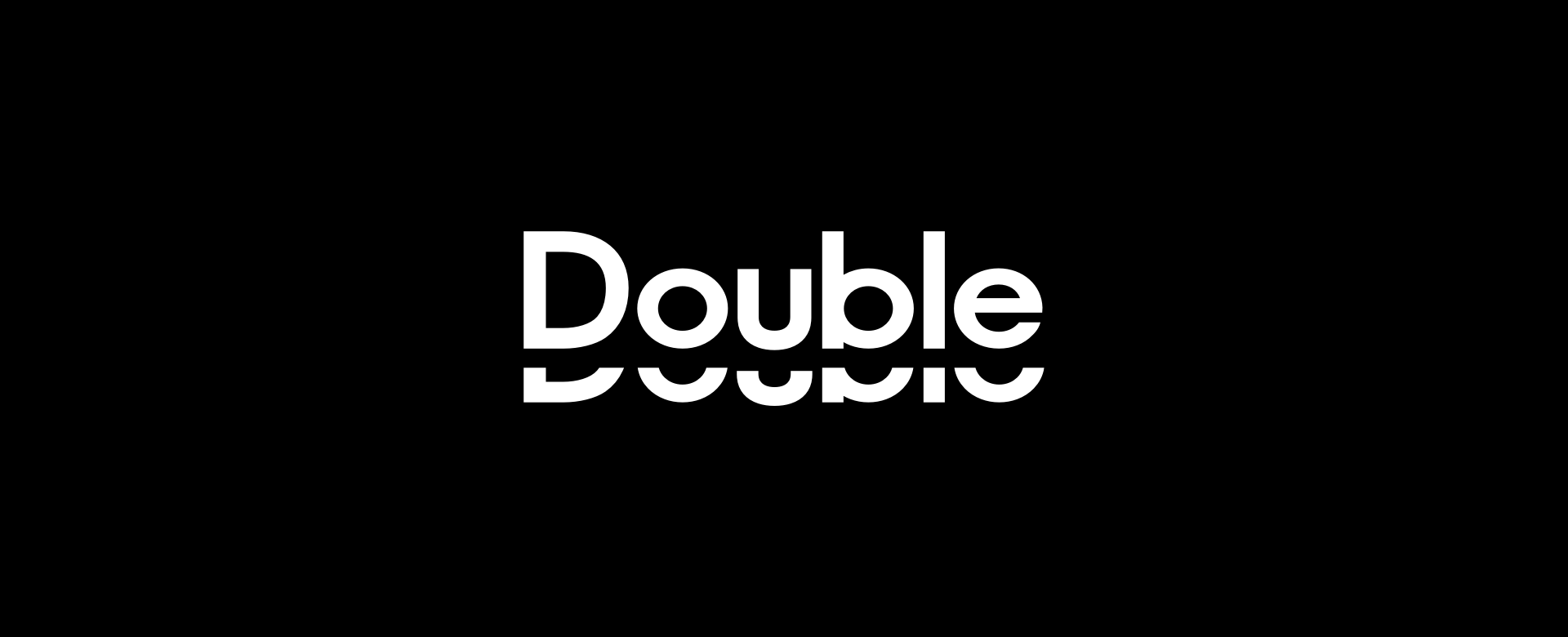
A graphic logotype, impactful but above all … Cinematographic!
- New site — doubledouble.be
- Backstage Film — Instagram
- Backstage Animation — Instagram
